10 Minimalist Teacher’s Day Card Designs That Are Simple and Beautiful
Disclosure: Some of the links in this post are affiliate links. This means if you click on the link and purchase an item, I will receive an affiliate commission at no extra cost to you. All opinions remain my own. I only recommend products or services I believe will add value to my readers.
Some gifts are beautiful because of how much they cost. Others are special because of the thought behind them. A simple card with a few carefully chosen details can sometimes mean more than an expensive present, especially when it comes from a student who wants to say thank you. That is what makes these 10 minimalist teacher’s day card designs worth considering. They combine clean layouts, gentle colours, thoughtful messages, and little decorative touches to create cards that feel personal without looking overly busy.
Teacher’s Day is a lovely opportunity to celebrate the people who help us learn, grow, and discover what we are capable of doing. A teacher may explain a difficult lesson several times, encourage a student who feels unsure, or notice a talent that nobody else has recognised yet. Although these moments may seem small, they can leave a lasting impression.
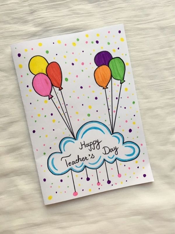
Therefore, choosing a card on these 10 Minimalist Teacher’s Day Card Designs that expresses genuine appreciation is a thoughtful way to celebrate the occasion.
However, you do not need complicated artwork, expensive stationery, or professional design skills to make something beautiful. In fact, minimalist designs often look best when they use fewer elements. A clean background, a short message, and one meaningful illustration can create a lovely result.
Additionally, these cards can suit different ages, personalities, and budgets. You can make one for a favourite primary school teacher, prepare several cards for different teachers, or create a more polished design using a digital tool such as Canva.
Even if you prefer delicate flowers, simple line drawings, elegant typography, or a modern black-and-white layout, there is an idea here to inspire you.
So, if you have been looking for 10 minimalist teacher’s day card designs that feel thoughtful, attractive, and easy to personalise, these ideas will help you find a style that works beautifully.
Check out
20 Christmas Gift Ideas for Teachers They’ll Truly Appreciate
25 Halloween Gift Ideas for Teachers They’ll Love This Spooky Season
20 Thanksgiving Place Card Ideas for Guests
60 Halloween Spooky Basket Ideas for Kids, Teens and Adults
10 Minimalist Teacher’s Day Card Designs
Minimalist cards focus on what matters most. Instead of filling every corner with decorations, they give each element enough room to stand out.
For example, a tiny flower can become the main feature when it sits on a plain cream background. Likewise, a short thank-you message can feel more meaningful when the lettering is clear and the surrounding space remains uncluttered.
The following 10 minimalist teacher’s day card designs offer different ways to achieve that balance. Some feel soft and elegant, while others are playful, modern, or artistic. Best of all, you can adapt each idea to suit the teacher receiving the card.
1. A Simple Floral Teacher’s Day Card
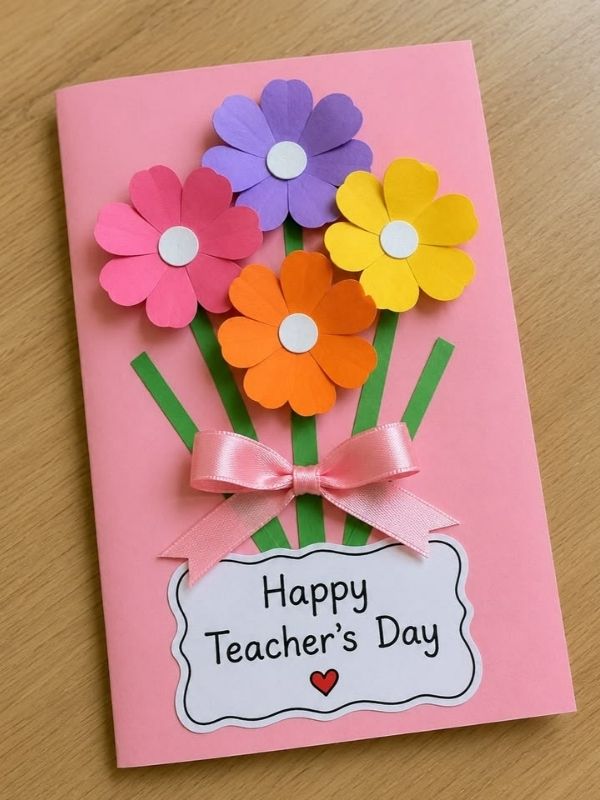
Flowers have a gentle way of expressing appreciation. They can represent kindness, growth, encouragement, and the beauty of helping someone flourish. For that reason, a floral card is a lovely choice for Teacher’s Day.
However, a minimalist floral design does not need a large bouquet or a colourful garden illustration. Instead, one small flower can become the entire focus of the card.
The beauty of one simple flower
Start with a white, cream, or pale beige card. Then, draw one flower near the centre or place it slightly toward the bottom corner.
A single daisy, tulip, or small wildflower can work beautifully. Keep the drawing simple by using thin lines and a limited number of colours.
For example, you could use a muted green stem with soft pink petals. Alternatively, choose a black outline on a white background for a more contemporary appearance.
The key is to let the flower stand on its own. Avoid adding several illustrations around it because too many details can take away from the clean look.
You can also use a small printed illustration if drawing is not your strength. A carefully selected image can achieve the same effect.
Choosing the right message
Place a short greeting above or below the flower.
You could write:
Thank you for helping me grow.
This message works particularly well because it connects the flower to the teacher’s role in encouraging learning.
Another option is:
Happy Teacher’s Day. Thank you for everything.
Keep the lettering readable and leave enough space around the words.
If you are making the card by hand, use a fine black pen or a simple coloured marker. Meanwhile, if you are designing it digitally, choose a clean font rather than one with too many decorative curls.
Making the design feel personal
Although the card is simple, you can still make it meaningful. Add the teacher’s name inside, followed by a sentence about something you appreciate.
For example, you might mention how the teacher explains difficult subjects patiently or makes lessons enjoyable.
This personal message gives the card more meaning than decoration alone.
Among these 10 minimalist teacher’s day card designs, the single-flower option is especially suitable for anyone who loves soft colours and timeless details.
Save for later
20 DIY Graduation Card Ideas for Best Friend
50 Short Father’s Day Messages for Cards
20 Easy DIY Father’s Day Cards at Home
2. A Minimalist Thank-You Typography Card
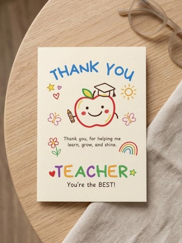
Sometimes, the most beautiful design is built around words rather than illustrations. A typography card uses lettering as its main decorative feature, creating a clean and modern appearance.
This is an excellent option when you want the message to stand out. It is also practical if you need to make several cards without spending too much time drawing.
Let the words take centre stage
Begin with a plain background. White, ivory, pale grey, and soft beige are all suitable choices.
Next, write the words Thank You in the centre of the card. You can use a bold, simple font or neat handwritten lettering.
The phrase should be large enough to attract attention immediately. However, it should not occupy every available space.
Leave a generous margin around the words. This empty space helps the design feel calm and balanced.
For a slightly more interesting result, place Thank on the first line and You underneath. Alternatively, use a small line above the greeting.
For example:
THANK
YOU
Happy Teacher’s Day
This arrangement is easy to read and works well on both handmade and digital cards.
Choosing fonts and colours
If you are designing the card on Canva, try combining two fonts that complement each other.
A clean sans-serif font can make the main greeting feel modern. Meanwhile, a smaller handwritten font can add warmth to the supporting message.
Nevertheless, avoid using too many font styles. Two complementary fonts are usually enough for a minimalist layout.
For the colour palette, consider black and white, navy and cream, or dark green and beige.
You can also use muted terracotta for a warmer appearance. The important thing is to maintain enough contrast between the lettering and the background.
Adding a meaningful sentence
A large greeting creates the visual impact, but the smaller message gives the card its emotional value.
Inside, write something specific about the teacher.
For example:
Thank you for your patience, encouragement, and the time you spend helping me learn. I appreciate everything you do.
A message like this feels sincere without being overly complicated.
Among these 10 minimalist teacher’s day card designs, a typography card is a particularly useful choice for students, parents, and anyone who prefers a neat, polished finish.
You may also like
25 Thanksgiving Gift Ideas for Employees They’ll Actually Appreciate
35 Black Friday Gifts Under $50 to Add to Your Shopping List
30 Thanksgiving Hairstyles Ideas for a Beautiful Holiday Look
3. A Black-and-White Minimalist Card
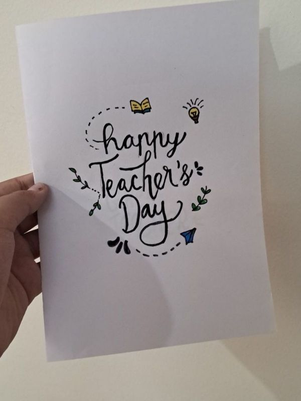
Black-and-white designs are simple, versatile, and easy to personalise. They also demonstrate that a card does not need bright colours to feel attractive.
When the layout is carefully planned, the contrast between black and white can create a striking result.
Creating a clean monochrome layout
Start with a white card and black lettering. Then, choose one small illustration to complement the greeting.
A pencil, open book, apple, or simple star can work well.
For example, draw a small outline of an open book above the words Happy Teacher’s Day. Keep the illustration light and avoid filling the entire card with black ink.
You could also place a thin rectangular border around the greeting. Leave the corners open if you want a softer, more contemporary look.
Another option is to use a black background with white lettering. However, make sure the text remains easy to read, especially if you are printing the design at home.
Why this design works
Monochrome cards are useful because they suit many different tastes.
Some teachers prefer colourful stationery, while others enjoy simple and understated designs. A black-and-white card offers a neutral option that feels appropriate in almost any setting.
It is also practical when you need to print several cards. You can create a neat design without relying on coloured ink.
In addition, the absence of colour encourages you to pay attention to spacing, alignment, and lettering.
A well-positioned illustration can have more impact than several unrelated decorative elements.
Personalising the monochrome card
To make the design warmer, include a handwritten message inside.
You could write:
Thank you for making learning easier and encouraging me to keep trying. Your support means a lot to me.
If the teacher has helped you through a particularly difficult subject, mention that experience in your own words.
You can also write the teacher’s name on the front in small lettering.
The result remains simple while feeling more personal.
Of all the 10 minimalist teacher’s day card designs, the black-and-white option is especially suitable for anyone who likes modern stationery, clean lines, and understated elegance.
You may also like
20 Christmas Gift Ideas for Teachers They’ll Truly Appreciate
25 Halloween Gift Ideas for Teachers They’ll Love This Spooky Season
Christmas Gift Ideas for Mum, Dad, Brother & Sisters
4. A Minimalist Pencil Illustration Card
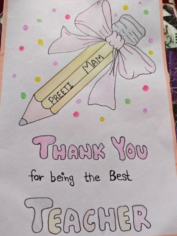
A pencil is one of the simplest symbols associated with learning. It represents writing, creativity, practice, and the everyday work that happens inside a classroom.
Because the shape is instantly recognisable, it makes an excellent illustration for a simple Teacher’s Day card.
Keeping the pencil illustration simple
Use a plain white or cream background. Then, draw one pencil vertically along the left side of the card.
Keep the outline thin and the details minimal. You only need a few lines to suggest the sharpened tip, body, and eraser.
For a little colour, choose soft yellow with a muted pink eraser. Alternatively, keep the pencil entirely black and white.
Place the greeting beside the illustration rather than directly over it.
For example:
You make learning brighter.
This short message connects the pencil to the teacher’s work without making the design feel crowded.
Another suitable greeting is:
Thank you for helping me learn.
Both options are clear and easy to understand.
Making the layout balanced
A common mistake with minimalist designs is placing everything too close together.
Instead, give the pencil and the greeting their own space. If the illustration sits on the left, align the words toward the right.
You can also position the pencil at a slight angle to create movement. However, keep the rest of the layout simple so the card remains balanced.
If you are creating the card digitally, use a clean line illustration. Avoid mixing a realistic pencil photograph with cartoon-style lettering because the different visual styles may not work well together.
Adding a handwritten note
The front of the card should remain simple. Inside, you can write a more detailed message.
For example:
Thank you for answering my questions, explaining things in different ways, and helping me understand new ideas. I appreciate the effort you put into teaching.
You do not have to use those exact words. In fact, your own message may feel more meaningful when it reflects a real experience.
This design also works well for a group card. Several students can sign their names inside while the front stays uncluttered.
Among these 10 minimalist teacher’s day card designs, the pencil illustration is a cheerful choice for primary school teachers, secondary school teachers, and tutors.
5. A Soft Pastel Teacher’s Day Card
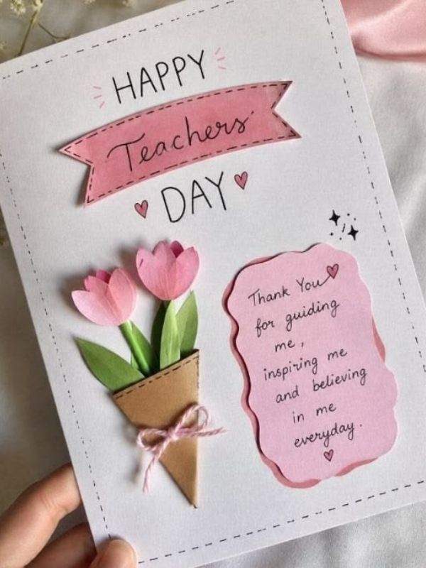
Pastel colours can make a card feel gentle, welcoming, and fresh. Soft pink, pale blue, muted lavender, sage green, and warm cream are all lovely choices.
However, the secret to a minimalist pastel card is using colour with restraint.
Instead of combining every pastel shade, choose one main colour and one supporting tone. This creates a more cohesive appearance.
Choosing a gentle colour palette
Start with a cream or white background. Then, add one soft pastel shape behind the greeting.
For example, a pale blue rectangle can sit behind the words Happy Teacher’s Day. Alternatively, a small lavender circle can frame a simple star illustration.
Keep the shape subtle. It should support the message rather than compete with it.
You can also use pastel lettering on a plain background. Nevertheless, check the contrast carefully so the words remain readable.
Very pale text on a white background can look attractive on a screen but become difficult to read when printed.
Keeping the card elegant
Pastel colours already provide visual interest, so you do not need many extra decorations.
A small flower, a thin line, or one simple heart is enough.
You might also use a tiny cluster of three stars above the greeting. Keep them small and leave the rest of the card empty.
For handmade cards, coloured pencils or light markers can create a soft finish. If you prefer a digital design, use flat colour blocks rather than heavy gradients or complicated effects.
The result should feel light and intentional.
Writing a thoughtful message
Pastel designs pair well with warm, encouraging words.
Consider writing:
Thank you for making the classroom a place where I can learn, ask questions, and grow.
This message works because it focuses on the teacher’s influence rather than making a general statement alone.
You could also add the teacher’s name inside the card and finish with your own name.
If you are giving the card to a teacher who has made a particular difference, include one short example.
That small detail makes the card feel less generic.
Among these 10 minimalist teacher’s day card designs, the pastel option is ideal for anyone who loves soft colours but still wants a clean and modern look.
6. A Minimalist Open Book Card
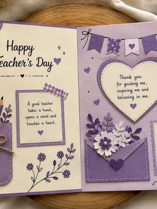
An open book is a meaningful symbol for Teacher’s Day. It represents knowledge, curiosity, and the many ideas students discover through learning.
It is also an easy shape to turn into a minimalist illustration.
Drawing a simple open book
Begin with a plain card in white, cream, or light grey.
Draw two simple curved shapes that meet in the middle to represent the pages of an open book. Add a short line down the centre and two or three small lines on each page.
You do not need to draw every page or add realistic details.
In fact, a simple outline often looks more attractive because it keeps the design clear.
Use black ink for the illustration or choose dark green for a softer appearance. You can add a tiny gold star above the book if you want a small decorative accent.
However, avoid adding several unrelated symbols. The book should remain the main feature.
Pairing the illustration with a greeting
Place the open book in the centre of the card. Then, write a short message beneath it.
For example:
Thank you for opening doors to new ideas.
This greeting connects the illustration to the experience of learning.
Another option is:
Every lesson helps me discover something new.
Both messages are suitable for teachers who encourage curiosity and help students approach difficult subjects with confidence.
Keep the text short enough to fit comfortably beneath the illustration.
If you use a digital design tool, make sure the book and the message align neatly. A little adjustment can make the entire layout look more professional.
Making the inside meaningful
An open-book illustration gives you a lovely starting point, but the inside of the card is where you can express personal appreciation.
You might write about a subject the teacher helped you understand or a lesson you still remember.
For example:
Thank you for making difficult topics easier to understand. Your patience has helped me feel more confident about learning new things.
This type of message is specific without being overly long.
It also works for tutors, librarians, teaching assistants, and other people who support learning.
Of these 10 minimalist teacher’s day card designs, the open-book card is a thoughtful option for teachers who encourage reading, discovery, and a love of learning.
7. A Minimalist Heart-Shaped Card

A heart is a simple way to express gratitude, kindness, and appreciation. Although it is a familiar symbol, it can still look modern when used thoughtfully.
The trick is to avoid filling the entire card with hearts, patterns, and decorative lettering.
One carefully placed heart can be enough.
Using one heart as the main detail
Choose a plain white, cream, or pale pink background.
Then, draw one small heart in the centre of the card. You can use a thin black outline, a muted red fill, or a soft terracotta shade.
For a more contemporary style, try an imperfect hand-drawn heart. Its slightly uneven lines can make the card feel personal rather than overly polished.
Place the greeting below the illustration.
For example:
Teaching with kindness makes a difference.
This message is especially suitable for a teacher who creates a supportive classroom environment.
You could also write:
Thank you for caring and helping me grow.
Keep the words simple so the design remains easy to read.
Choosing the right finishing touches
A minimalist heart card does not need glitter, ribbons, or several layers of decoration.
Instead, focus on the paper, spacing, and handwriting.
If you are making the card by hand, use a fine pen and draw the heart slowly. If the first attempt does not look perfect, you can practise on scrap paper before working on the final card.
For a digital version, choose a clean heart illustration rather than a detailed clip-art image.
You can also add a thin line beneath the greeting to separate the illustration from the text.
Nevertheless, remember that the card should feel warm, not overly formal.
Adding a sincere thank-you
Inside, write a few sentences about what you appreciate.
For example:
Thank you for being patient when I need extra help and for encouraging me to keep trying. I appreciate the kindness you show in the classroom.
A message like this focuses on the teacher’s actions.
That matters because genuine appreciation often feels more meaningful when it explains why someone is valued.
You can also personalise the card by mentioning a moment when the teacher helped you feel included or supported.
Among these 10 minimalist teacher’s day card designs, the heart-shaped option is a lovely choice when you want the card to feel warm, simple, and sincere.
8. A Minimalist Apple Illustration Card
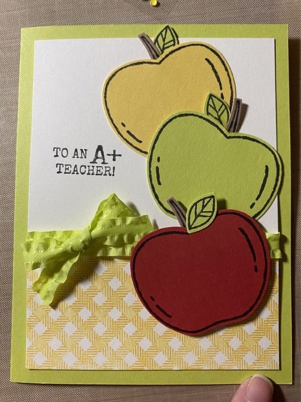
The apple is a familiar classroom symbol. It is often associated with teachers, school traditions, and the relationship between teaching and learning.
Because the shape is simple, it works well in a clean card design.
Creating a simple apple illustration
Start with a white or light beige card.
Draw one small apple in the centre or near the lower corner. Use a simple outline and add a short stem with one leaf.
For colour, consider muted red, dusty rose, or sage green.
You can also use a black-and-white outline if you prefer a monochrome design.
Avoid adding a basket of apples or a detailed classroom scene. One illustration will keep the card looking neat.
If drawing is difficult, use a basic apple icon in a digital design tool. Choose one with clean lines and minimal detail.
The illustration should be easy to recognise without taking up too much space.
Adding a clever message
An apple card gives you room to use a short message that connects the illustration to appreciation.
For example:
You’re an apple-solutely wonderful teacher.
This is a playful option for someone who enjoys light-hearted messages.
If you prefer a more straightforward greeting, write:
Thank you for helping me grow.
You can also place Happy Teacher’s Day at the top and the teacher’s name underneath.
Choose a readable font and keep the message short. A clever phrase is most effective when the rest of the design remains simple.
Keeping the card suitable for different ages
An apple illustration can work for young children, teenagers, and adults.
For a younger student, a soft red apple with a handwritten greeting may feel cheerful. For an older student, a small line drawing on a cream background can create a more refined result.
You can also adjust the message to suit your relationship with the teacher.
A younger student might write about a favourite lesson. An older student may choose to thank the teacher for guidance, patience, or encouragement.
Either way, the personal message matters more than the complexity of the design.
Of these 10 minimalist teacher’s day card designs, the apple illustration is a familiar, friendly choice that works particularly well for school celebrations.
9. A Minimalist Geometric Teacher’s Day Card
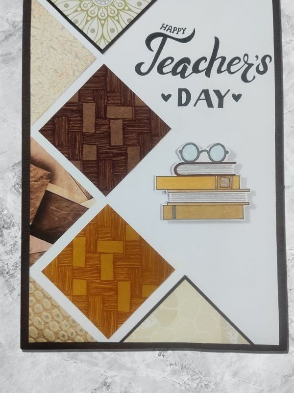
Geometric designs use simple shapes, clean lines, and careful spacing to create visual interest.
This makes them ideal for anyone who prefers modern stationery rather than floral illustrations or traditional classroom symbols.
You can create an attractive geometric card using circles, rectangles, arches, or thin lines.
Building the design with simple shapes
Start with a plain background.
Then, choose two or three shapes and arrange them around the greeting.
For example, place a small beige circle near the top-left corner and a thin sage-green rectangle near the bottom. Write Happy Teacher’s Day in the centre.
Alternatively, create a simple arch behind the greeting using two complementary colours.
Keep the shapes flat and avoid unnecessary shadows or decorative effects.
The goal is to create balance rather than fill every empty area.
You can make this design by hand using a ruler and coloured paper. However, a digital tool may be easier if you want perfectly aligned shapes.
Choosing colours that work together
A geometric card looks especially good when the colours feel connected.
For instance, you could combine cream, sage green, and dark grey. Another option is pale blue, white, and navy.
If you enjoy warmer colours, try beige with muted terracotta and brown.
Limit the palette to two or three shades. Too many colours can make the card feel busy, which takes away from the minimalist style.
Also, keep the lettering simple. A clean sans-serif font often complements geometric shapes well.
Adding warmth to a modern design
Although geometric cards can look polished, they should still communicate appreciation.
Inside the card, write a message that feels personal.
For example:
Thank you for sharing your knowledge, encouraging questions, and helping me see new possibilities.
This message suits a teacher who enjoys explaining ideas and encouraging independent thinking.
You can also include a small handwritten signature to soften the modern appearance.
That contrast between a clean front and a personal note inside creates a lovely balance.
Among these 10 minimalist teacher’s day card designs, the geometric option is a good choice for anyone who loves modern layouts, neutral colours, and simple shapes.
10. A Minimalist Handwritten Message Card
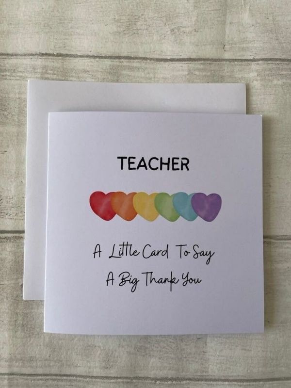
Sometimes, you do not need an illustration at all.
A handwritten message can become the entire design, especially when the words are arranged carefully and the card uses beautiful, simple stationery.
This option is also one of the easiest to personalise because the message itself carries most of the meaning.
Letting handwriting become the design
Choose a plain card in white, cream, or pale beige.
Then, write a short greeting in the centre using neat handwriting.
For example:
Happy Teacher’s Day
Underneath, add:
Thank you for helping me believe in what I can learn and achieve.
Leave plenty of space around the words.
You can use black ink for a classic finish or dark blue for a softer appearance.
If your handwriting is not naturally neat, practise the message on another sheet first. You do not need perfect lettering. Instead, aim for words that are clear and easy to read.
You could also use printed lettering on the front and reserve the handwritten message for the inside.
Making a simple card feel thoughtful
A plain card can look unfinished if the layout has no clear structure.
To avoid this, pay attention to alignment and spacing.
Place the greeting near the centre, then add a small line or dot beneath it if the design needs a little detail.
Alternatively, write the teacher’s name in smaller lettering above the greeting.
Keep the front uncluttered. Resist the urge to add extra decorations simply because there is empty space.
That open space is part of the design.
Writing a message that feels genuine
The inside of the card is your opportunity to say something meaningful.
Instead of writing only Thank you for everything, explain what you appreciate.
For example:
Thank you for taking the time to explain lessons, answer my questions, and encourage me when something feels difficult. Your support has helped me learn with greater confidence, and I am grateful for the effort you put into teaching.
You can shorten the message if you prefer. The important thing is to use words that reflect your own experience.
If you are a parent writing on behalf of your child, you can also thank the teacher for their patience, communication, and support throughout the school year.
Among these 10 minimalist teacher’s day card designs, the handwritten option is especially meaningful because it puts the message before the decoration.
Frequently Asked Questions About 10 Minimalist Teacher’s Day Card Designs
Choosing a card can feel surprisingly difficult when you want something simple but still memorable. These answers cover a few common questions about minimalist Teacher’s Day cards, from choosing colours to writing the right message.
What makes a Teacher’s Day card minimalist?
A minimalist Teacher’s Day card uses a small number of visual elements to create a clean and balanced design.
For example, it may feature one flower, a short greeting, or a simple line illustration. Instead of filling the card with decorations, it leaves enough empty space for each element to stand out.
Neutral colours, readable fonts, and straightforward layouts are also common features.
However, minimalist does not mean boring. A carefully chosen illustration or a thoughtful message can make a simple card feel distinctive.
The aim is to create a design that looks intentional without becoming crowded.
What should I write inside a Teacher’s Day card?
The best message is one that expresses genuine appreciation.
You could thank the teacher for their patience, encouragement, helpful explanations, or willingness to answer questions.
For example:
Thank you for helping me understand new ideas and encouraging me to keep learning. I appreciate the time and care you put into teaching.
You can also mention a specific lesson or moment that made a difference.
If the card is from a parent, you might thank the teacher for supporting your child’s learning and helping them feel encouraged.
Keep the message natural. You do not need complicated words to express sincere gratitude.
Are handmade minimalist Teacher’s Day cards a good idea?
Yes. Handmade cards can be lovely because they allow you to add personal details.
You might draw a small flower, write the greeting by hand, or use coloured paper to create a simple shape.
However, the card does not need to look professionally made.
A clear message and a thoughtful design are often enough.
If you are making cards with younger children, let them contribute in a way that suits their abilities. They could write their names, draw a small picture, or choose the colours.
The finished card will feel personal because it reflects the effort and thought behind it.
How can I make a simple Teacher’s Day card look elegant?
Start with good spacing.
A clean layout with enough empty space often looks more elegant than one filled with decorations.
Next, choose a limited colour palette. Cream with dark green, white with black, or beige with muted pink can all work well.
Use one clear font for the main greeting and a smaller style for the supporting message.
Finally, keep the illustration simple.
A tiny flower, a thin border, or a small star can provide enough detail. You can also write a personal message inside to make the card feel more meaningful.
Can students give the same card design to different teachers?
Yes, especially if you are preparing cards for several teachers.
You can use one basic design and personalise each card with the teacher’s name and a different message.
For instance, one card might thank a teacher for making science easier to understand, while another might recognise a teacher’s patience during reading lessons.
This approach saves time while ensuring each card feels individual.
If you prefer, you can also change the illustration or colour slightly for each recipient.
The important thing is to make the message appropriate to the teacher receiving it.
Do minimalist Teacher’s Day cards need pictures?
No. A card can look beautiful with lettering alone.
A simple greeting in a clear font can create a polished appearance, especially when it is placed carefully on a plain background.
You can also use a small line, a border, or a geometric shape instead of an illustration.
Nevertheless, if you enjoy drawing, a single flower, pencil, book, or apple can add personality.
Choose whichever option feels right for the message you want to communicate.
Minimalism is about making thoughtful choices, not following a strict rule that every card must look the same.
How can I make a Teacher’s Day card more personal?
The easiest way is to include a detail that relates to the teacher.
Think about something they have done that you appreciate. Perhaps they explain difficult lessons patiently, encourage you to ask questions, or make the classroom feel welcoming.
Then, mention that detail in the message.
For example:
Thank you for taking the time to explain things when I do not understand them the first time. Your patience has helped me feel more confident about learning.
A message like this feels personal because it describes a real quality.
You can also write the teacher’s name on the front and sign the card inside.
What is the easiest minimalist Teacher’s Day card to make?
A handwritten thank-you card is one of the simplest options.
All you need is a plain card, a pen, and a short message.
Write Happy Teacher’s Day on the front, leaving plenty of space around the greeting. Then, add a personal note inside.
If you want a small decorative detail, draw one heart, star, or flower.
Another easy option is a typography card with the words Thank You in the centre.
Both designs are straightforward, inexpensive, and suitable for different ages.
Conclusion
A thoughtful Teacher’s Day card does not need complicated artwork or a long message to make an impression. Sometimes, a single flower, a simple illustration, or a few carefully written words can express appreciation beautifully.
These 10 minimalist teacher’s day card designs offer different ways to celebrate the teachers who help students learn, grow, and discover their abilities. From soft pastel cards and monochrome layouts to open-book illustrations and handwritten greetings, each idea shows how simplicity can create a meaningful result.
The best part is that you can adapt every design to suit your budget, available materials, and personal style. You might make a card by hand, create one digitally, or use a simple printed layout with a handwritten message inside.
However, remember that the design is only part of the experience. The words you choose can make the card much more personal.
Rather than writing a general thank-you, think about what you appreciate most about the teacher. Mention their patience, the way they explain difficult lessons, or the encouragement they offer when learning becomes challenging.
That small detail can turn a simple greeting into a lasting expression of gratitude.
So, choose a design you love, keep the layout clean, and write a message that comes from the heart. After all, celebrating a teacher is not about creating the most elaborate card. It is about taking a moment to recognise the care, effort, and encouragement that make a difference in the classroom.